Color Theory: Colors in Fashion and Clothing
- Ankur Bagai

- Jun 24, 2020
- 3 min read
According to color theory, harmonious color combinations use any two colors opposite each other on the color wheel, any three colors equally spaced around the color wheel forming a triangle, or any four colors forming a rectangle (actually, two pairs of colors opposite each other). The harmonious color combinations are called color schemes – sometimes the term ‘color harmonies’ is also used. Color schemes remain harmonious regardless of the rotation angle.
We have often heard in terms of clothing or generally in fashion, the word used as "Complimentary Color" or "Color that compliments", both have the same meaning and both of them signifies one simple theory known as Color Theory. While even if you're not into an artistic field or know much about the theory, you might have heard or studied it in Junior and Middle School as part of Fine Art subject mainly Primary, Secondary and Tertiary Color around which the theory or color is based around.

While the same color wheel might not be as simple as they taught in school but it is easier to understand fashion. Essentially you need to understand 3 things:
Color Temperature
Color Scheme
Color Psychology
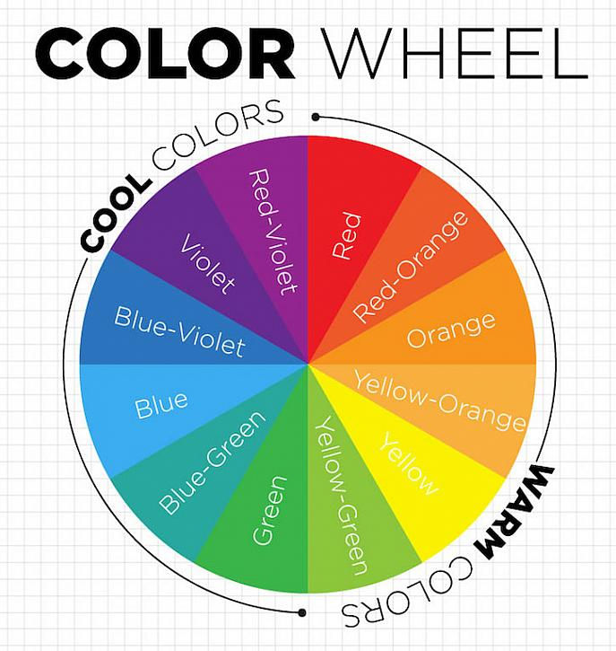
Let's start with Color Temperature. We have warm colors, and we have cool colors. Anything between Red and Yellow Green is represented as warm colors while anything between Red-Violet and Green is represented as cool colors which can be seen in the color wheel below. Warm colors exhibit energy and joy (best for personal messages), while cool colors convey calmness and peace (best for office use).
Second is color schemes, there are 5 basic color schemes followed worldwide to mix and match the colors, which are:
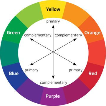
Complementary colors are any two colors opposite each other on the wheel. For example, blue and orange, or red and green. These create a high contrast, so use them when you want something to stand out.
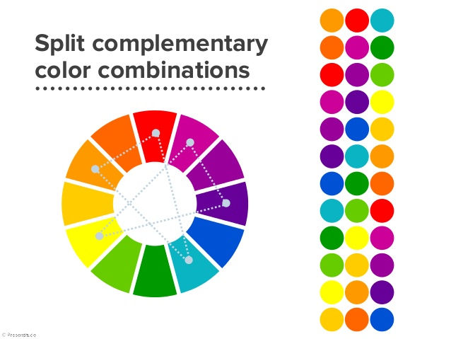
Split complementary colors use three colors. The scheme takes one color and matches it with the two colors adjacent to its complementary color. For example, blue, yellow-orange, and red-orange. This scheme is ideal for beginners because it is difficult to mess up.
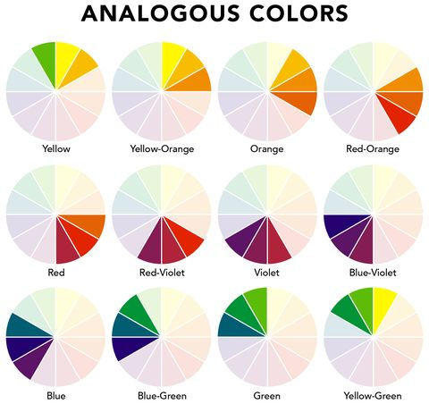
Analogous colors are any three colors next to each other on the wheel. For example, orange, yellow-orange, and yellow. With analogous colors, it’s best to avoid hues as they can be jarring.
Triadic colors are any three colors that are equally apart on the color wheel. For example, red, yellow, and blue. The Triadic scheme is also high-contrast, but more balanced than complementary colors. The trick is to let one color dominate and accent with the other two.

Tetradic or double complementary colors uses four colors together, in the form of two sets of complementary colors. For example, blue and orange are paired with yellow and violet. This is the hardest scheme to balance.
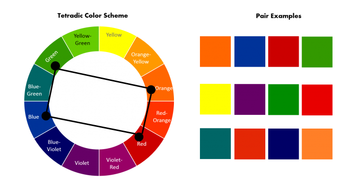
It offers more color variety than any other scheme (but) if all four colors are used in equal amounts, the scheme may look unbalanced, so you should choose a color to be dominant or subdue the colors. Avoid using pure colors in equal amounts.
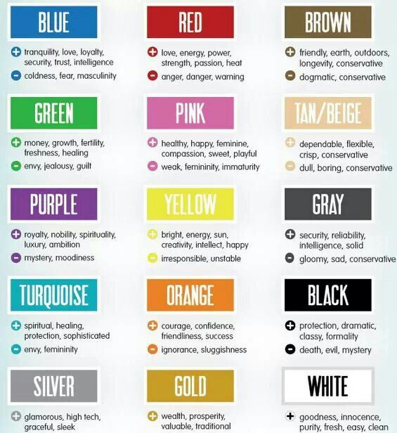
Lastly color psychology, color therapy hinges on color theory. In Fashion, the colors we choose to wear in essence symbolizes how we feel about ourselves or the persona we want to achieve. It can be understood through the chart given below.
While this isn't all you need to learn, as in this 3 part color theory article we will talk about essentials or basic color every guy need as well as in our last blog we will talk about color according to your skin tone and some colors which are always in trend.


Comentários